
Introducing the SonderMind Native App
SonderMind rapidly expanded from a small startup in Denver, Colorado, to operating in numerous cities across 16 states. As our services grew, we noticed more clients preferring mobile web usage during video sessions, rather than desktops. To adapt and improve the client experience, we strategically launched native iOS and Android apps. This move aimed to enhance usability and bolster SonderMind's competitiveness in the market.
Roles
Research
Testing
Design
Implementation
Platform
iOS
Android
Web
Challenges
Significant scope
The app we’d been using was built as a progressive web app. This meant a brand new start for both iOS and Android platforms. Every feature, every corner of the product, and even brand-new native design system components were on our list. It wasn't just about improvement; it was a chance to eliminate tech and UX debt that had accumulated over the years. Striking the right balance, we navigated the fine line of enhancing the product while maintaining parity between the app and mobile web.
Misaligned incentives
This shift also brought about a change in our workflow. Previously, we were crafting responsive code that seamlessly updated in our web app. With this new venture, it wasn't just about redesigning and developing each section; we also had the task of establishing a process for other teams to integrate with a native app. Juggling various teams, each with their unique metrics and goals, proved to be a challenge as their roadmaps were already packed, leaving little room for additional tasks.
Approach
A simpler, unified Messaging area
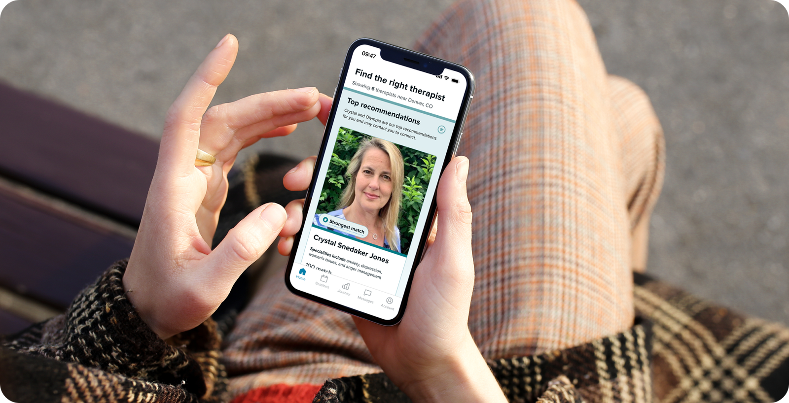
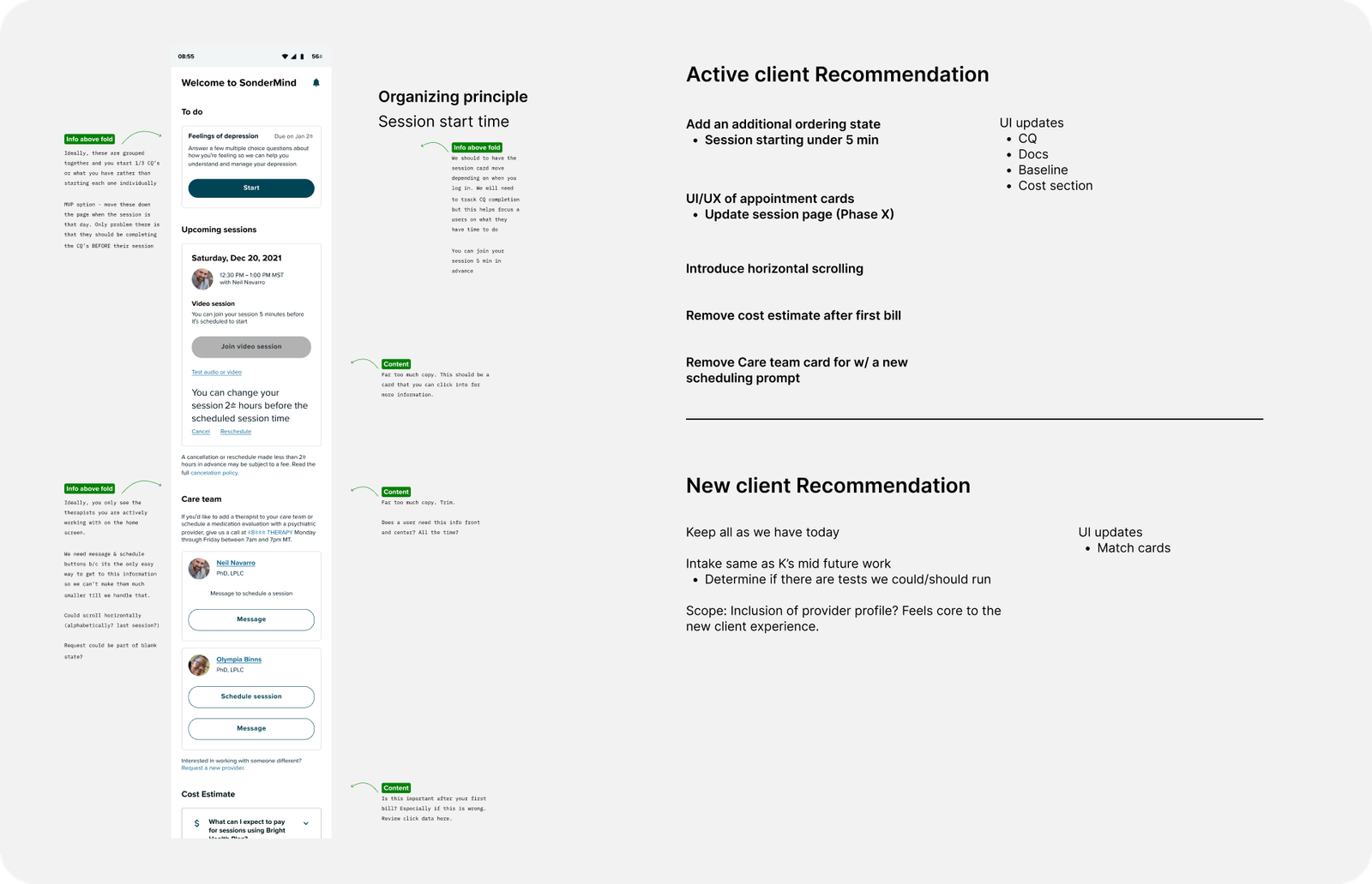
We delved into analytics and conducted research to pinpoint the high-engagement areas within the product. This highlighted that the messaging feature between clients and therapists was the most widely used on mobile web. To enhance this interaction, I implemented a redesign that included a new global navigation, leveraged native components, and introduced innovative patterns. The goal was to elevate and optimize the user experience, making the process of messaging therapists more intuitive and efficient.
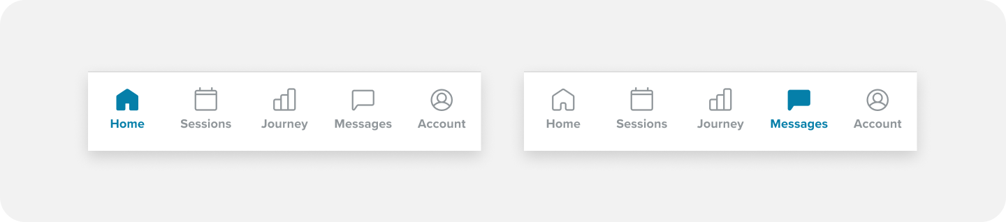
New global navigation: Previously on mobile web, the Messaging feature was tucked away behind a hamburger navigation, making it less noticeable to clients, who might miss out on new messages. Since our research showed us the importance, I introduced a global navigation, ensuring users could effortlessly access their messages and promptly spot any notifications awaiting their attention.
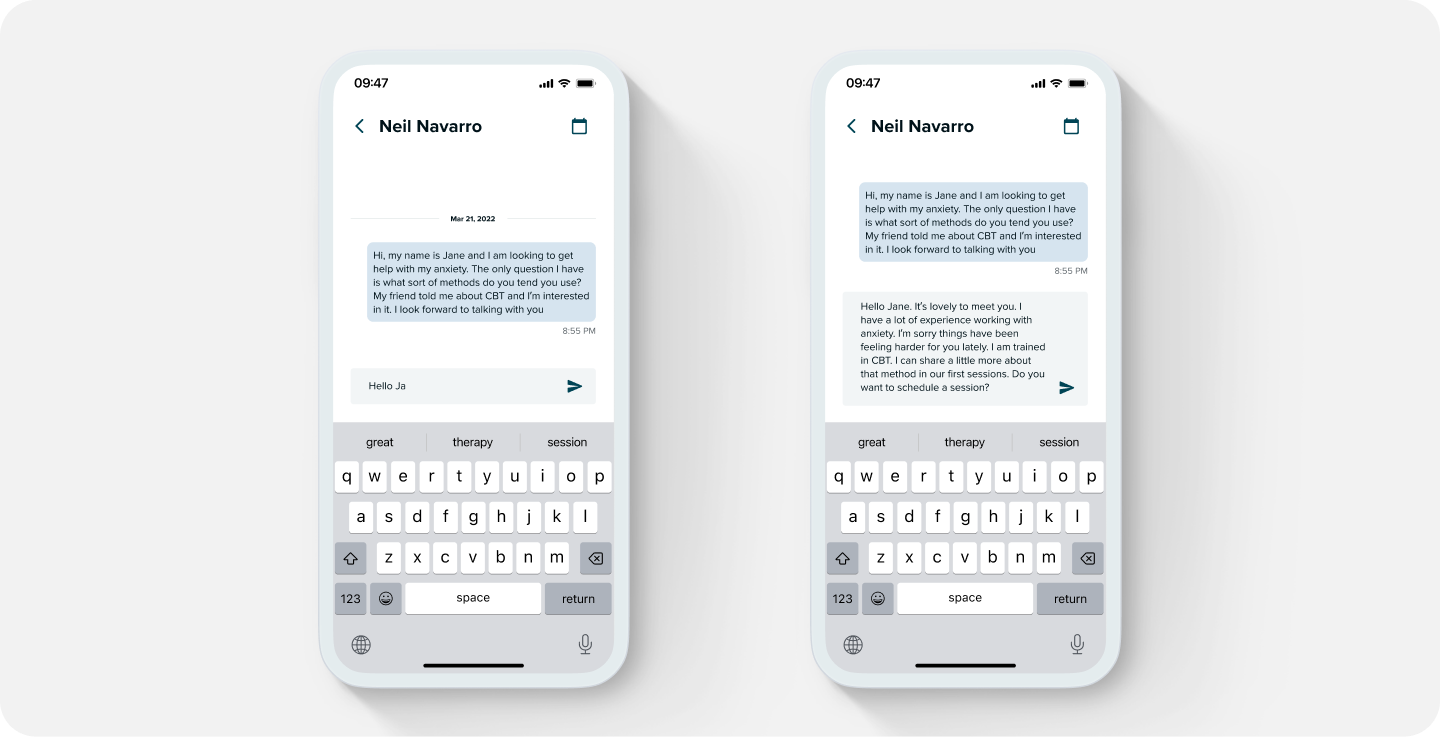
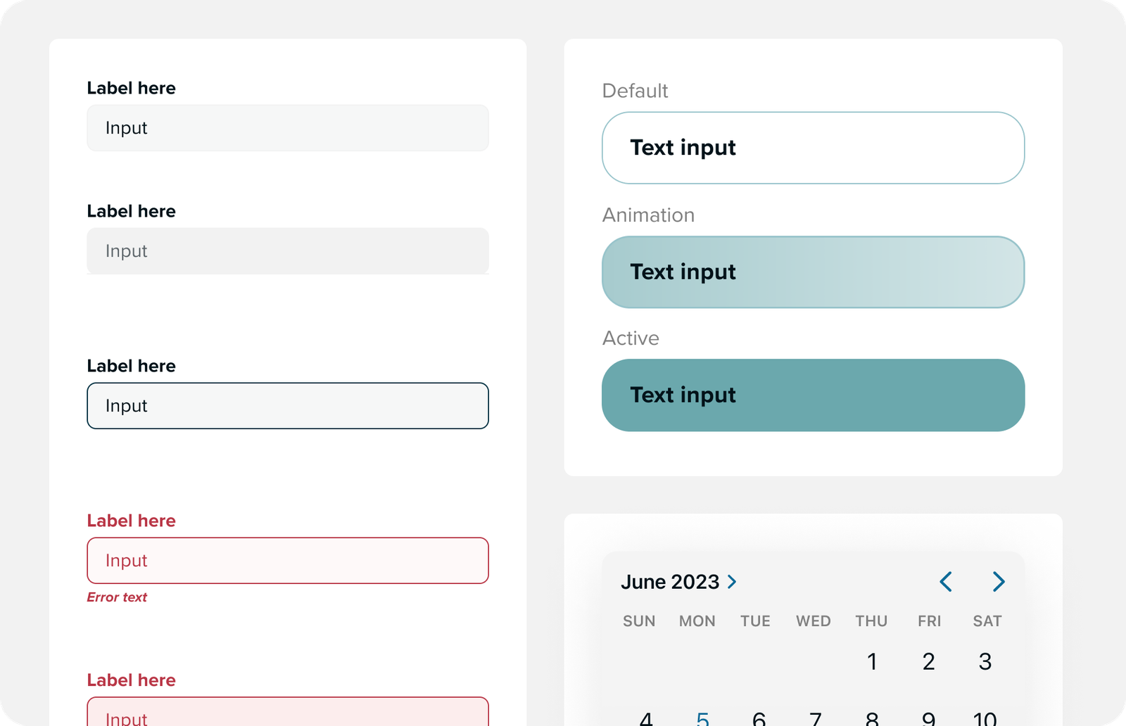
Enhanced native keyboard and text fields: Our research uncovered widespread frustration regarding the size of the text field, particularly when users wanted to proofread longer messages while typing. To address this issue, we introduced a dynamic text field. This not only proved easy to implement but also led to a substantial improvement in usability, addressing the users' feedback and enhancing their overall experience.
Connecting with a therapist
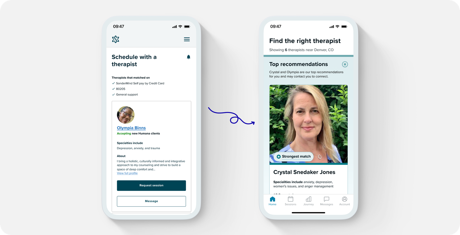
Revamped user onboarding: In the initial design of our web app, users were limited to logging in to existing accounts, posing a hurdle for new users attempting to connect with therapists or complete the onboarding process. This required them to visit the website first to fill out a matching form. However, our analytics illuminated a significant number of downloads with minimal subsequent usage.
To tackle this challenge, we introduced a new entry point directly within the new native apps. This allowed users to seamlessly connect with therapists, streamlining their journey from download to engagement.
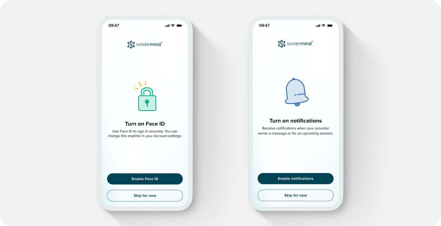
Biometrics and notifications: To simplify the login processes and easily keep users logged in, we introduced biometrics or Face/Touch ID. Embracing a practice common among industry competitors, this not only enhanced security but also enabled us to deliver timely push notifications to our clients. We integrated this into the onboarding experience for new clients and extended its benefits to existing clients upon login.
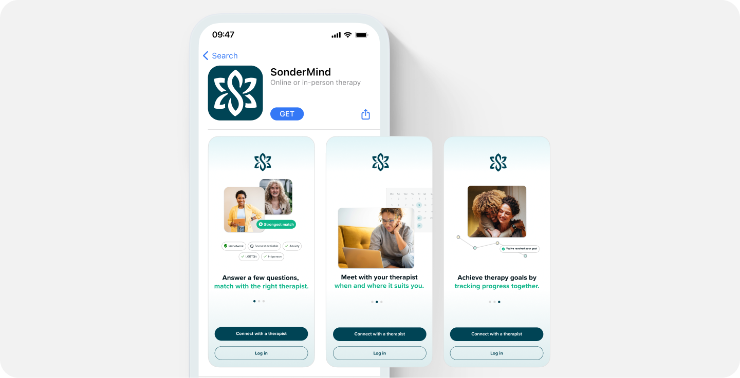
Onboarding and brand (AHA!) moment: Recognizing a lapse in our app store images and description, which hadn't seen updates in a couple of years, I took the initiative to refresh these screens. The goal was to provide a more informative and engaging experience for new users, helping them grasp the essence of SonderMind, understand the process, and recognize the value they could derive from our platform.
Web and native solution: Since we weren’t quite sure how many users we would be able to capture, we went with a quick and iterative approach to enhance the experience and learn. We kept certain, isolated web-based flows rather than taking the time to recreate these natively. This strategic choice allowed us to adapt quickly, refining the process as we gained a deeper understanding of our user base.
Component library
Over the course of the redesign, I collaborated with the design team to introduce a spectrum of new components. This involved incorporating native components with updates aligned to SonderMind's brand identity, introducing new variants to existing components, and implementing global updates to certain web components for uniformity. To ensure transparency and seamless coordination, we documented everything using both Knapsack and Figma.
Results
More downloads
Despite not actively promoting the app on our website or mobile web at this stage, we have seen a consistent month-over-month increase in downloads.
Decrease in login failures
The implementation of biometrics for login authentication contributed to a decrease in login failures. This seamless authentication method not only simplified the login process but also fostered a sense of security and trust among users.
Next steps
We have a long way to go to continue to enhance the experience.
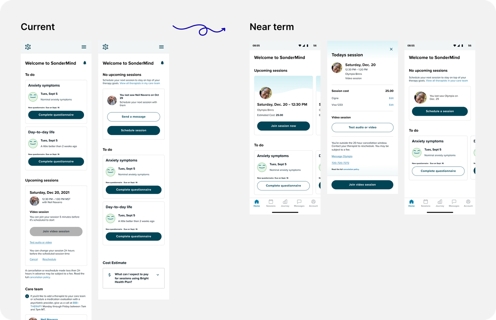
Transitioning from web to native experiences: Currently, our app offers a blend of web-based and native experiences. While this setup has allowed us to move quickly, it has resulted in certain sections of the app falling short of our desired standards. To address this, our immediate focus is on updating the homepage. By breaking down the homepage into distinct, easily manageable modules, we aim to enhance navigation, improve content visibility, and set ourselves up for a more personalized, future experience.
Improving user ratings: Recognizing the importance of user feedback, we need to address the pain points or shortcomings highlighted in our app's current ratings. As we continue to refine and optimize the user experience, our overarching goal is to elevate user satisfaction levels and drive significant improvements in app ratings. This involves not only addressing existing issues but also proactively identifying opportunities for enhancement and innovation to exceed user expectations.